

The next era of design is Intent-driven
How adaptive UIs are transforming user-centered design

This morning, Google gave me the weather, Manchester United's stats, and stock performance—each in a dynamic, interactive format. No clicks, just answers. It struck me how far we've come. As someone who's spent years designing interfaces, I couldn't help but marvel at how we've transformed the humble search bar into something almost magical.
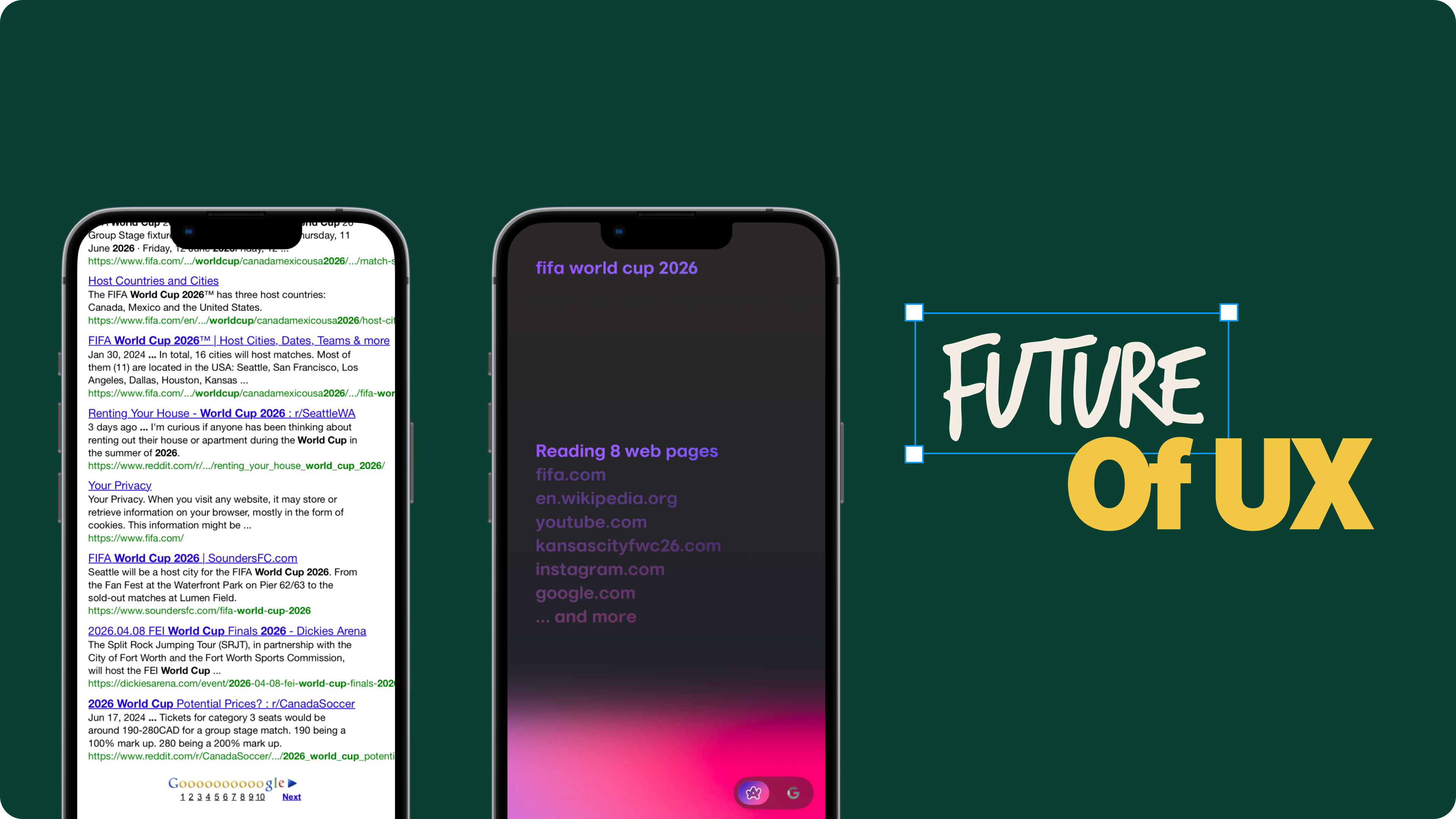
Remember 2005? If you had told me back then that I could simply ask my phone "How's United doing?" and instantly get not just the score, but a beautiful visualization of the match—complete with key moments, player stats, and tactical breakdowns—I would've laughed. No sports websites, no clicking around. Just ask and receive. Sounds like sci-fi, right? Yet here I am, watching interfaces adapt and flow with my needs like a second skin.
This got me thinking about our journey with search interfaces. It's not just about technological leaps—it's about how deeply we've come to understand the way people seek and digest information. Let me take you through this evolution that's fascinated me for years.
The evolution through the ages
Chapter 1 - The computing age: Storage and processing
Although I wasn’t born during this time , I read about those early interfaces (1950s-1980s) basically described as glorified filing cabinets—green text on black screens, with all the charm of a tax form. But they laid the foundation for everything that followed.
Chapter 2 - The internet age: Distribution and links
Then came the 1990s, and everything exploded. The web transformed into this vast maze of interconnected pages, with Google's "ten blue links" serving as our digital library card catalog. I vaguely remember writing essays on topics such as World War II back in 2006—tab after tab, window after window, manually stitching together fragments of information like a digital quilt. It wasn't pretty, but it worked. Until it didn't. As the web grew, we needed something smarter, something more intuitive.
Today, that same research takes seconds. Need to understand the Battle of Midway? Here's an interactive timeline, key events, and strategic analysis, all neatly packaged and ready to explore.
Chapter 3 - The knowledge graph era: Understanding and context
2012 was a game-changer. Google dropped the Knowledge Graph, and suddenly searching for "Marie Curie" felt like having a conversation with a knowledgeable friend—her biography, achievements, and scientific legacy all right there, no link-hopping required. It wasn't just prettier; it reflected a fundamental truth about how we seek information: we don't want breadcrumbs, we want the whole story.

Jack Menzel, who was Google's Product Management Director at the time, put it perfectly: "The Knowledge Graph was born from observing how people actually use search. Users weren't just looking for links; they were looking for answers and understanding."
This shift changed everything about how we approached interface design. Now we had rich information panels that gave immediate context, data structured to highlight what matters most, visual hierarchies that matched how we naturally explore topics, and suggestions that seemed to read our minds. Remember the old days of recipe hunting? Going from tab to tab, comparing ingredients and steps? Now it's all there, instantly organized and ready to use.
Chapter 4 (Now) - The contextual UI era: Adaptive and intelligent
Fast forward to today, and I'm still amazed by how search interfaces have transformed. The really fascinating part? The interface shapeshifts based on what you're looking for. It's like having a personal research assistant who knows exactly how to present information to you. Let me show you what I mean:
Search for a restaurant, and you'll see photos, reviews, peak hours, and popular dishes in a card-based layout

Dynamic views for hotels, restaurants and attractions on Google Look up a sports match, and you'll get a specialized interface showing scores, player statistics, and key moments

Different cards shown contextual to a game when searched on Google Research a stock price, and you’ll find a detailed analysis with trends, earning calls, income statement reports, news that are relevant to the stock.

Stock related informational cards on Google


What gets me excited isn't just the technical wizardry—it's how these interfaces are changing our expectations everywhere else. They call it the "spillover effect." Once you've experienced this kind of seamless interaction with search, you start wondering why other apps can't be just as intuitive. Why do I need to navigate through five screens in an app when Google can give me everything I need in one glance? Why isn't my project management tool smart enough to adapt its interface based on what I'm trying to accomplish?
The shift in user expectations is clear:
We want information at our fingertips, no navigation maze required
Our interfaces should read the room and adapt accordingly
Information should come in the format that makes sense for the task
The interface should be one step ahead, anticipating what we need next
With AI technologies like GPT-4 and Claude pushing the boundaries of what's possible, these expectations are only growing stronger. As designers, we're facing an exciting challenge: How do we create products that don't just meet these expectations but exceed them?
The next wave: Beyond search
I've spent a few hours studying this evolution from "ten blue links" to today's rich, contextual experiences, and something clicked: search interfaces didn't just get better at search—they are writing the playbook for modern software design. Watching Google morph its layout from weather to sports scores to stocks made me realize we're witnessing something bigger than just improved search results.
May be we've been looking at interfaces all wrong. We assumed they needed to be fixed structures that users would eventually learn, like memorizing the layout of a keyboard. But that's backwards. What if interfaces could bend and flow around our needs, like a conversation with a knowledgeable friend? The really exciting part? It's already happening. From data analysis tools to creative suites to learning platforms, we're seeing interfaces that adapt to us, not the other way around.
Let me show you how some modern products are already running with this idea.
1. Amplitude smart analytics through natural queries
The shift from traditional dashboards to conversational interfaces in Amplitude illustrates how search’s evolution is reshaping professional tools. Amplitude transforms data analysis from complex navigation to natural conversation, aligning interface design with human intent.
The traditional way — A maze of clicks: Most of us know the frustration of trying to analyze user behavior in traditional analytics tools. Want to know how UK Android users progress through onboarding? Prepare for a clicking marathon: navigate menus, set filters, adjust date ranges, configure visualizations. Each click pulls you further from your analytical thinking, forcing your brain to speak the tool's language rather than your own.
The new way — Just ask: Now, with tools like Amplitude’s Ask Interface you simply type what you want to know: "How many UK Android users completed the first three onboarding stages between August 7 and 24?" Seconds later, there's your answer with perfect visualization. It's like having a data-savvy colleague who just gets it. No more context-switching between analysis and tool manipulation.
Design decisions, UX principles, and Human behavior: Amplitude’s design decisions reflect key UX principles focused on reducing cognitive load and enhancing user efficiency. By adopting natural language input, the interface supports the way people naturally think and ask questions, removing the friction of translating intent into rigid system commands. This approach respects the user’s mental model, keeping them in a state of flow.
The shift to conversational analytics is a response to human behavior patterns — users want immediacy, simplicity, and context-awareness. Instead of navigating complex menus, users can engage in a dialogue with data, making insights more accessible and reducing the frustration of context switching. This design choice ultimately empowers users to make faster, more informed decisions, aligning the interface with real-world tasks and goals.
2. Arc Search’s browse for me
Just as Amplitude transformed data analysis from navigation to conversation, Arc's Browse For Me feature takes a similar leap with web browsing. It's tackling a problem we all face daily: turning the web's chaos into something that makes sense.
The traditional way — Information fragmentation: Traditionally, researching a topic like say, footballer Andrés Iniesta meant juggling multiple tabs across Wikipedia, sports sites, and news sources, forcing users to mentally piece together fragmented information.
The new way: Intelligent organization: With Arc’s Browse For Me, you simply express your interest in learning about Iniesta. The interface automatically:
Creates a clean, organized page about his career & Structures information logically (early life, club success, achievements)
Presents European statistics in a clear format & details his post-Barcelona career
Provides relevant sources for deeper exploration
Instead of jumping between tabs, you get a coherent narrative that maintains the depth of multiple sources without the fragmentation
Design Decisions, UX Principles, and Human Behavior: Arc’s Browse For Me embodies key UX principles: reducing cognitive load, maintaining flow, and enhancing comprehension. By automatically structuring information, it respects how users naturally process complex topics — through organized, contextual learning.
This approach acknowledges that users seek coherent stories, not disconnected facts. The design minimizes the friction of context switching and supports a more fluid reading experience. By aligning with human behavior — our preference for integrated, narrative-driven learning — Arc turns web exploration into a focused, intuitive journey. This design decision ultimately helps users achieve deeper understanding with less effort.
3. Gong’s real-time adaptive sales intelligence

My wife comes home with the best sales stories. For the past few months, I've heard about the circus act sales reps perform during calls—trying to build relationships while frantically searching through a dozen tools for the right information. "It's like trying to have a great conversation while simultaneously solving a Rubik's cube," she tells me. Knowing about the issues they deal with made me appreciate what Gong is doing to revolutionize the sales process.
The traditional way — Juggling between interfaces: Sales reps must constantly switch between CRM tabs, meeting notes, competitor analysis, and case studies during client calls. This context-switching disrupts conversation flow and delays critical responses, potentially undermining client confidence.
The new way — Dynamic, context-aware UI: Gong’s AI-powered interface listens, transcribes, and analyzes sales calls in real-time, providing relevant information at the exact moment you need it. Instead of scrambling for answers, insights appear seamlessly:
Competitor Mentions: If the client mentions “Acme Corp,” Gong surfaces a competitor comparison chart.
Pricing Queries: When pricing comes up, a dynamic pricing module shows packages and past discounts.
Implementation Concerns: For timeline concerns, Gong displays industry-relevant case studies.
Risk Alerts: If risky phrases like “We’re evaluating other vendors” arise, real-time prompts help you address objections immediately.
Gong eliminates the need to juggle multiple tools, turning sales calls into fluid, focused conversations that prioritize understanding and serving the client.
Design Decisions, UX Principles, and Human Behavior: Gong’s adaptive interface is grounded in key UX principles: contextual awareness, real-time assistance, and cognitive load reduction. By delivering insights in the moment, Gong supports the way sales reps naturally process information — through seamless, uninterrupted interaction.
This design reflects a deep understanding of human behavior: people struggle with multitasking under pressure. By proactively surfacing information, Gong helps reps maintain focus and flow, reducing stress and enabling better decision-making. The interface adapts to the conversation’s context, mirroring how humans think and respond in real-time, ultimately enhancing both the efficiency and effectiveness of sales interactions.
4. AI-Powered development: The end of context switching
Back in 2012, before my transition to design and when I was writing code, my desk setup looked like a mission control center—multiple monitors, endless terminal windows, and enough Chrome tabs to crash my laptop. Fast forward to today, and I watch our dev team face the exact same struggles. Different tools, same old context-switching headache. Some things never change, right?
The traditional way — Tool juggling: A simple coding task often requires developers to navigate a maze of tools — writing code in an editor, debugging in a browser, running commands in a terminal, searching for documentation, managing version control, and referencing multiple tabs. Each switch between these tools disrupts focus, forcing developers to juggle multiple mental models and break their workflow. This fragmented process interrupts productivity, making it difficult to maintain a state of creative flow.
The new way — Intent-driven development: Modern AI-powered tools like Cursor.so unify coding tasks into a seamless interface. Instead of juggling multiple tools, you express your intent — “Add a dark mode toggle” — and the interface generates code, shows live previews, highlights changes, and applies updates. AI assistants like Claude in VS Code and ChatGPT’s Code Interpreter enhance this with real-time suggestions and explanations, eliminating context switching.

These tools excel in their contextual awareness of development workflows. Platforms like Replit Ghost integrate debugging, surface relevant documentation, and adapt testing and deployment dynamically. Vercel provides live deploy previews within the coding environment. This shift transforms coding into a fluid, creative process, letting developers focus on problem-solving instead of managing tools.
Design decisions, UX principles, and Human behavior: These AI-powered tools reflect critical UX principles like reducing cognitive load and preserving flow state. By unifying environments and minimizing context switching, they align with how developers naturally think and work. The focus on intent-driven interaction helps developers stay engaged, turning coding from a fragmented task into a fluid, creative process. This shift empowers developers to focus on problem-solving rather than tool management, enhancing productivity and satisfaction.
Key design themes: Connecting to human behavior
Modern adaptive interfaces are deeply rooted in human psychology and behavioral patterns. By understanding how users think, learn, and interact, these design themes ensure products are more intuitive, efficient, and satisfying. Here’s a deeper look at each theme and how it connects to human behavior:
1. Intent-first interaction
Concept: Users express their goals naturally, and the interface interprets and fulfills those goals without rigid structures.
Human behavior connection: People prefer to articulate what they want directly, rather than adapting to predefined workflows. Traditional interfaces force users to break down tasks into system-specific commands, which increases cognitive load and friction. By supporting natural goal expression, intent-first interaction aligns with how the human brain works — focusing on outcomes rather than processes. This approach reduces frustration and helps users maintain focus, making digital interactions feel more intuitive and human-centered.
2. Contextual intelligence
Concept: Interfaces adapt to the user’s journey by preserving context and anticipating needs.
Human behavior connection: Humans rely heavily on context to make decisions and retain information. When interfaces maintain context — remembering previous actions, queries, or steps — they reduce the mental effort required to retrace paths or rebuild context. This mirrors how humans think, helping users stay oriented and avoid the cognitive drain of recalling information manually. Context-aware interfaces make interactions seamless, reducing the need for repetitive inputs and enhancing efficiency.
3. Unified experience spaces
Concept: Consolidating multiple tasks within a single interface to minimize context switching.
Human behavior connection: Maintaining a state of flow is essential for productivity. Each time a user switches between tools or tabs, their flow state is disrupted, leading to mental fatigue and reduced efficiency. Unified experience spaces minimize these disruptions, allowing users to remain deeply engaged with their tasks. This reflects the human preference for continuous, uninterrupted work, reducing cognitive load and enhancing overall satisfaction.
4. Progressive intelligence
Concept: Interfaces reveal advanced capabilities gradually, aligning with the user’s experience and learning pace.
Human behavior connection: Humans learn best when information is delivered in manageable increments. Overloading users with features can lead to frustration and overwhelm. By progressively revealing capabilities, interfaces cater to the user’s natural learning curve, building confidence over time. This supports a sense of mastery and encourages exploration, fostering a more engaging and satisfying user experience.
5. Fluid information architecture
Concept: Information dynamically reorganizes itself based on the user’s needs and context.
Human behavior connection:
Humans are adaptable and process information best when it aligns with their immediate goals. Static, rigid hierarchies force users to adjust their thinking to the interface. In contrast, dynamic information structures support how people naturally absorb, filter, and act on new data. This flexibility reduces cognitive strain and makes interactions feel intuitive, as the interface morphs to support changing needs.
The opportunity of adaptive design
As I wrap up my thoughts, I can't help but feel a mix of excitement and responsibility. We're standing at a fascinating intersection where AI's capabilities are finally catching up to how humans naturally think and work. The patterns we've explored aren't just theoretical frameworks—they're glimpses into a future I believe we can build.
These aren't just fancy interface tricks. They're about fundamentally rethinking how technology can adapt to human needs, rather than the other way around. Every example I've shared today, from Amplitude to Arc Search, is just scratching the surface of what's possible.
In my next article, I'll dive deeper into specific industries ripe for this transformation.
I started this exploration wondering how we got from "ten blue links" to where we are today. But now I'm more interested in where we're heading. The era of rigid, one-size-fits-all interfaces is ending, and it's our job as designers to shape what comes next. We have both the tools and the understanding to create interfaces that feel less like software and more like thoughtful collaborators. The future of design isn't just adaptive and contextual—it's profoundly human.
What a great observation and beautifully written piece. I’m really keen to see how intelligent machines shape the way we interact with products (putting on my curiosity glasses)
Great read! It’s difficult to hit the sweet spot between providing too much/unnecessary information and providing exactly what the user wants (without them asking for it), but it can be a really magical user experience when you do.